Create log health dashboard using time based data
This article is about how to create a dashboard using log data. We want to analyze relevant time-sensitive data in a dynamic and visually meaningful way.
Use case
An example application is when an application or script feeds data from various endpoints or microservices via a central logging solution and this data is then to be visualized. You can find more information about a simple and scalable solution for central log management here: Centralize log collect... | LNC DOCS (lucanoahcaprez.ch)
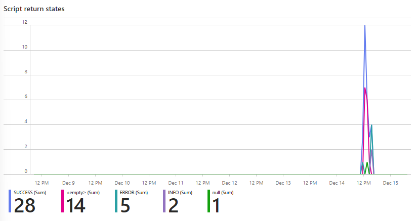
This example graph displays values of a PowerShell script that runs at the log in of a user. The script then has statuses, which are then written to an Azure Log Analytics Workspace. This diagram can now be used to see at what time which status was created.
Behind this view there is the following KQL query:
let start_time = {TimeRange:start};
let end_time = now();
let time_range = start_time - end_time;
<yourlogtable>
| where TimeGenerated >= start_time and TimeGenerated <= end_time
| make-series count() default=0 on TimeGenerated from start_time to end_time step 1h by State_s
| render timechart
This query uses the value of the variable "{TimeRange:start}" for dynamic change based on the selection. More on this dynamic strategy is described here: Use of variables & dyn... | LNC DOCS (lucanoahcaprez.ch)